First, let's just take a look at them side-by-side:


As you can see, there are some things that haven't changed. OK, one thing - the background. The same soothing blue gradient tones. Ahhh. Feel the tension drain from your shoulders as you take in the tranquil blue background.
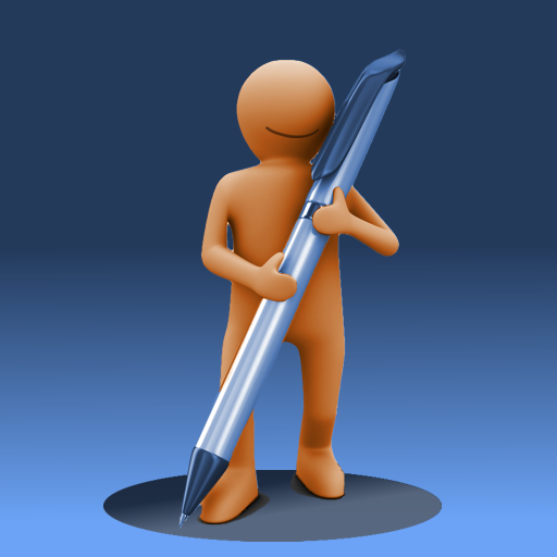
For the person-shaped thing, I wanted to go from the amorphous blob to something a little more defined, and refined. Especially when blown up to larger size, the brown snowman-looking dude wasn't cutting it. Once a family member asked me if I thought it looked like a toilet with the seat up, I knew I needed a change. The new guy looks much better, and certainly won't be mistaken for a toilet. You can clearly see where he's come from, but he's evolved. Look ma! I've got arms and legs!
Keeping with the evolution theme, I decided that the big fat pencil had to go. It has now been replaced with a sleek-looking pen.
Finally, I decided to tie the logo into the new name, by having the guy cast a round shadow. A spot, if you will.
I quite like our new mascot and logo. I think our mascot is also quite pleased with the result. After all, he's smiling.
Share this: